
NewDay Care, a digital company based in Lyon, was founded in 2022 with the vision of enhancing employee well-being, driving social change within workplaces, and minimising costs associated with corporate social performance. Their platform provides diagnostic tools, development resources, and ongoing support services to empower individuals in their self-improvement journey, strengthen team unity, and elevate job satisfaction and engagement.
Values: Innovative, think differently, caring, cisruptive, daring, ambitious, fresh, dynamic, useful
Vision: To be world wide company providing the best advices and the best tools for people to be who they are at the workplace, to be happy and fulfilled
Culture: Performance, bienveillance, open-minded, kind
Not's: Not doing what's existing in the market, not a startup
Newday Care needs to find a suitable, business-user-oriented flow on their website in order to generate more leads and improve conversion rate of companies accessing the Newday Care Plan.
One of the key areas of Newday Care website is their business page where visitors can find information and statistics about employees well-being.
The client expressed his wish to redesign the business offer page into a more modern, interesting, inviting and convincing one for the decision makers.
Next, I needed to find the design opportunities that are strategically important for NewDay Care, we collaborated a clear and realistic business need, then I jumped into the UX Strategy and UX Research.
I started by heuristic evaluation of the existing business offer page, followed by competitors analysis and finally market positioning.
Four bigger competitors of the Newday Care are: Calm, Super Mood, GoalMap and MindDay. The business offer page differs on each of the websites. Supermood is funny, colorful and uses a famous witty quote. Goalmap is concentrated on advantages of their platform, their offer is very broad though. MindDay is interactive and quite modern and Calm is eye-pleasing, almost duo-tone with their blue and white design, it is also the most popular one.
Thanks to the CSD matrix I could prepare qualitative fallowed by the quantitative research.
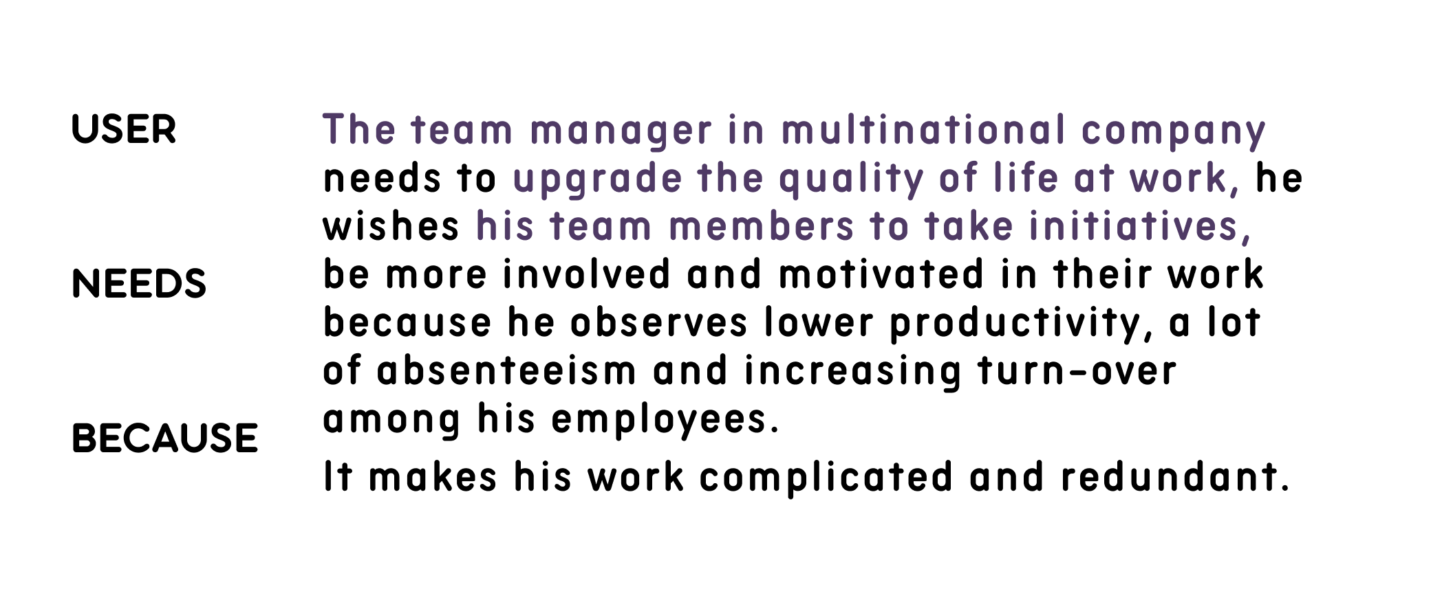
User interviews and survey results allowed me to discover the motivations that would encourage business decision-makers to take advantage of Newday Care plan, as well as the biggest pain points and habits they observes in professional environment. Here are the main outtakes.
Need: Focus on content adressing these needs, engaging and underlining the pain points.
Right after the discovery, I tried to define my findings, first by creating a persona, then I created an Empathy Map in order to collaborate visualisation to articulate what we know about our user.
By this mean I managed to externalise knowledge about user in order to create a shared understanding of users needs and help in formulating the problem statement.
After defining the main user task and flow, I attempted to create the first set of lo-fi wireframes to run some preliminary testing with the actual users. That allowed me to gather some initial feedback and save time later in the process before I started the high-fidelity prototype.
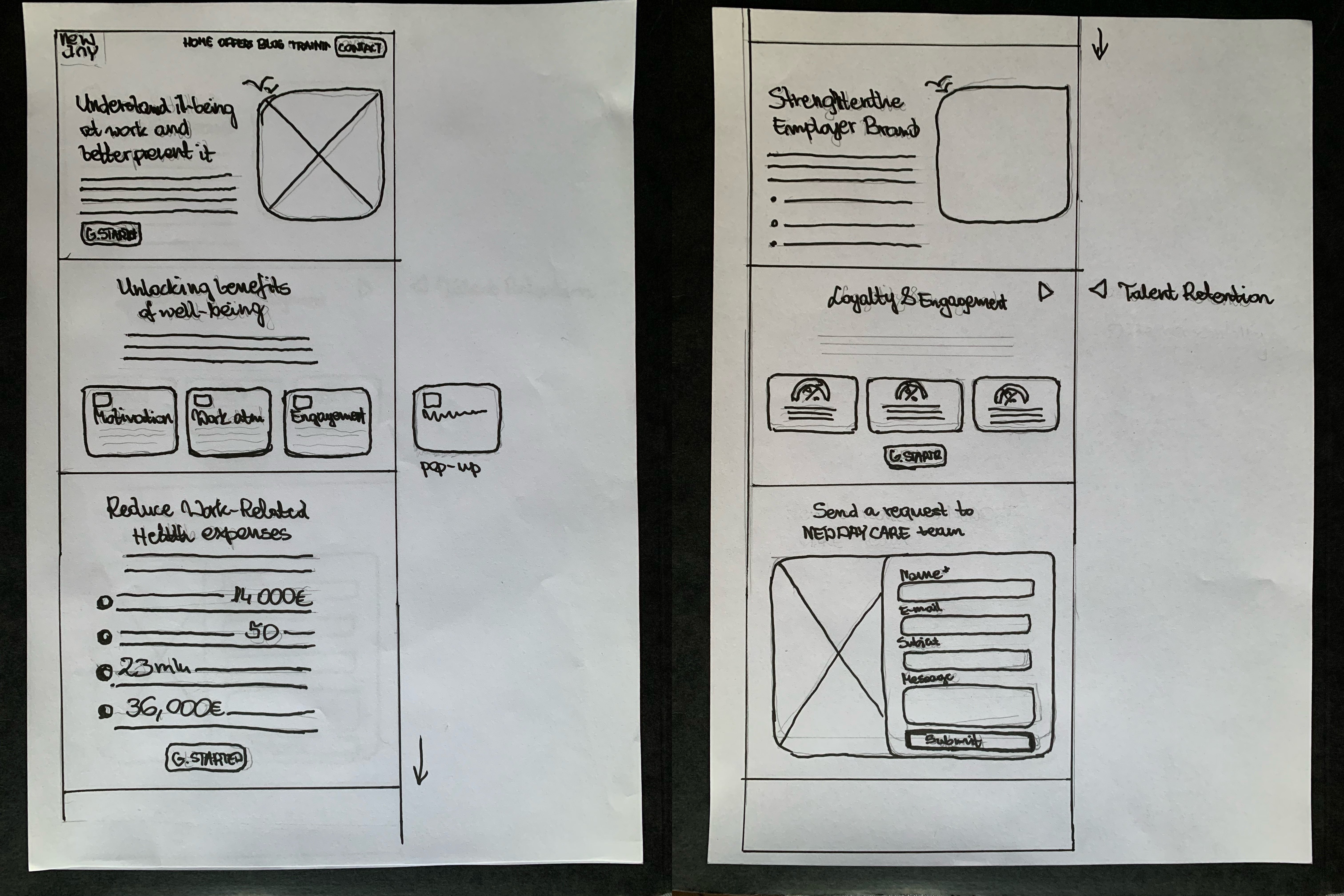
The first round of testing I decided to make a couple of iterations that included: Making the main topics info more prominent. Switching images placement to guide the user towards the CTA's. Updating overall information hierarchy to make the critical info stand out.
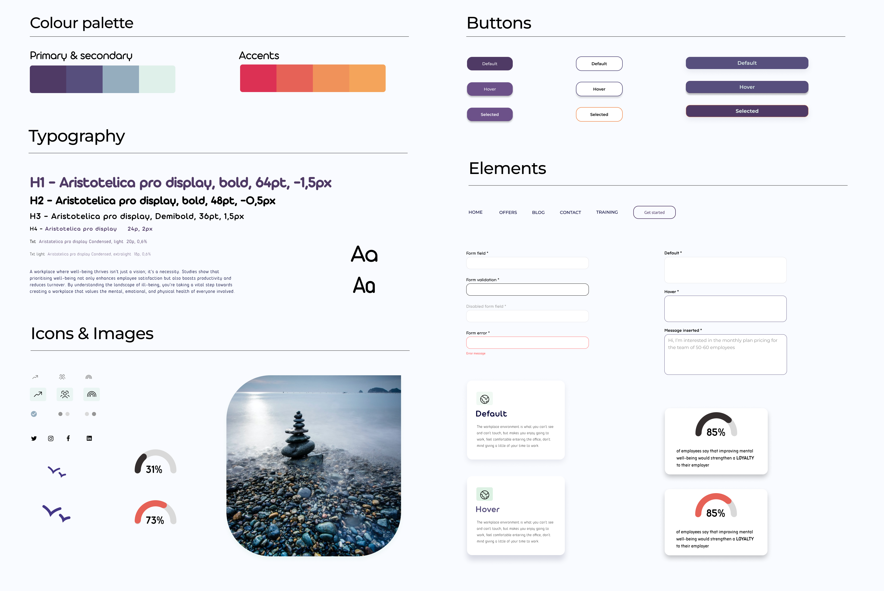
I created a simple set of icons, buttons and elements, and a colour palette using an aubergine tint of purple as a primary colour and I complemented it with this aqua as a secondary. As an accents colours I used different shades of the logo. I wanted this page to represent more approachable, inviting business but official and clear at the same time.
For the typography I choose to propose few variants of Aristotelica,
If you like what you see and want to work together, get in touch!
martyna_typology@outlook.com