
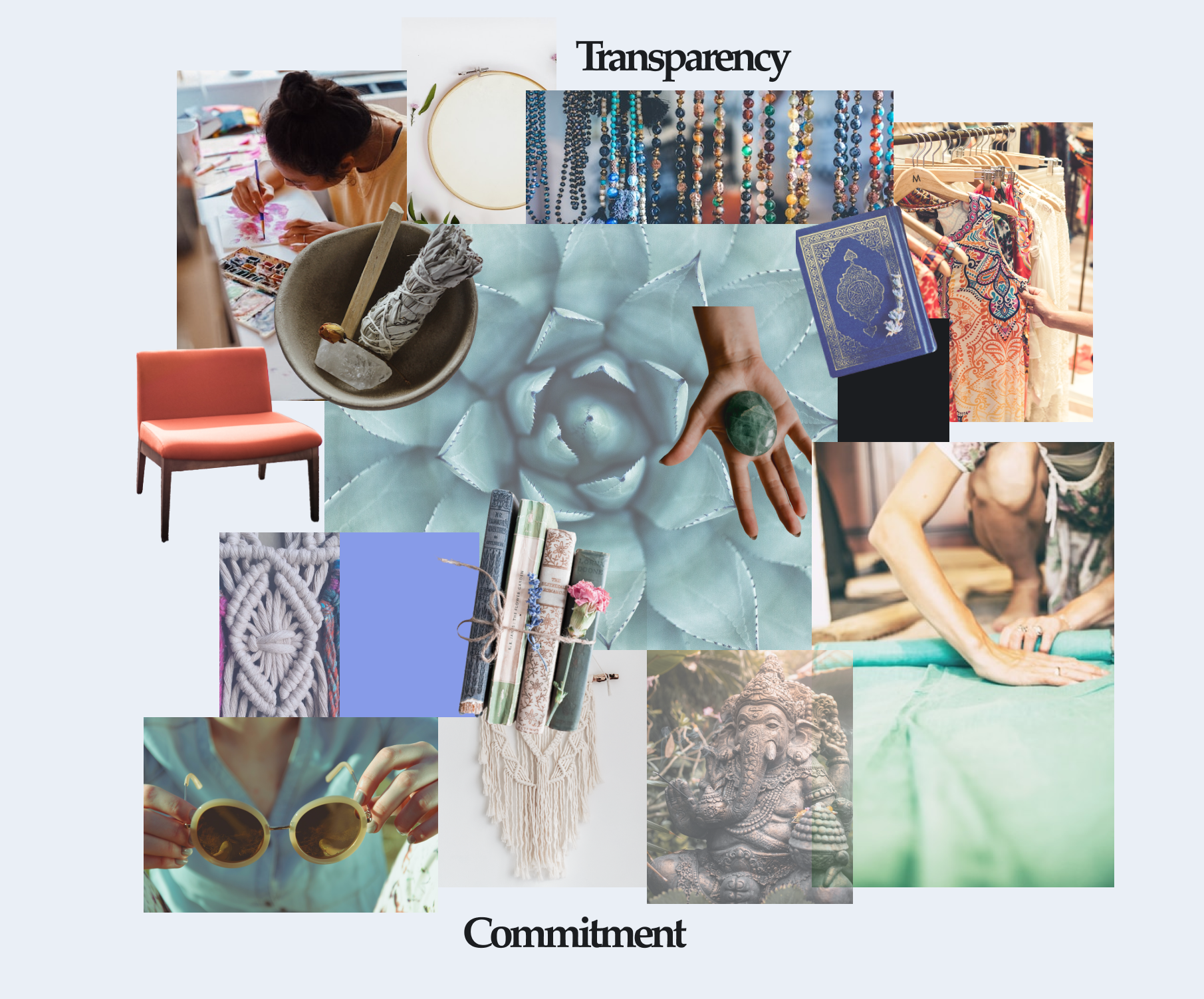
I must admit that redesigning a well known app in just 4 days is a big challenge. Of course Etsy has a great multi-disciplinary design team, from researchers, product and brand designers, strategists to information architects. After all I decided to go with my knowledge and aesthetics to come up with some ideas and represent them in Figma. Here is why I chose to redesign Etsy app:
Etsy has been launched in 2005 by Robert Kalin and his friends, in response to the lack of a steady market for handmade niches. What’s interesting is that Kalin also designed Etsy’s logo, for which he used the Minister EF Book font.Over the years Etsy created a powerful brand image around its logo. The Etsy logo is considered as being simple, legible, memorable, versatile and timeless.
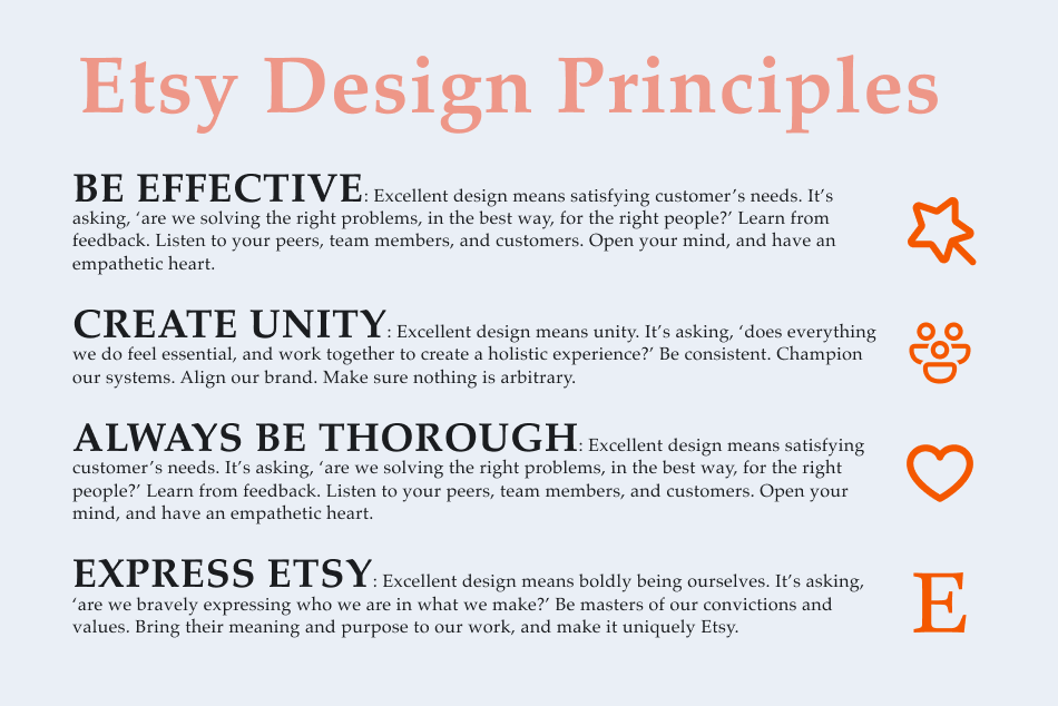
Etsy's team defined what guides everyone in their work at Etsy, and what principles have a clear voice, tone and value of Etsy. Here is what their Design Team came up with:
Etsy Design Team on Twitter:“@etsydesign
We design human-centered experiences, empowering creative people around the world to buy and sell the things they love. #keepcommercehuman”
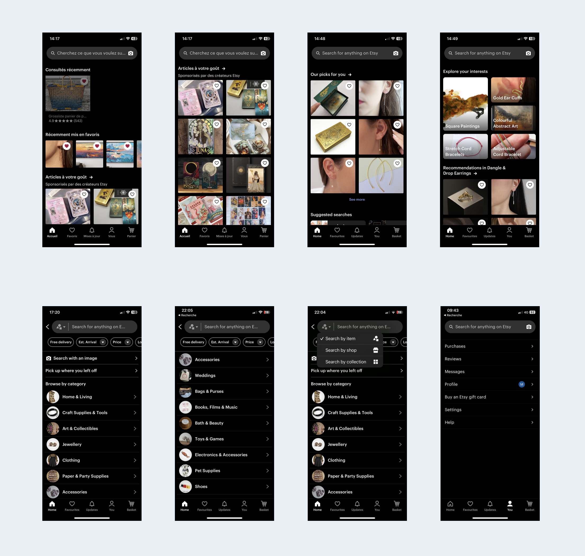
In order to deconstruct the user interface design, on the Etsy application I made a several screenshoots (mostly on homepage and on user’s account page) and I have analysed the UI details searching for the visual patterns so I can think about the possible areas of improvement.
Areas of improvement are Consistency and standards and Aesthetics and minimalist design, here are my fundings:
Typography is a part of the visual language that brand uses to communicate with it’s users.
Etsy is using different variants of Guardian Egyptian and Graphic typefaces (varying from medium to regular size) all over their application. Guardian Egyptian in a slab sherif, which are considered powerful and strong. I think it feels too sharp and raw for the brand that’s mostly about handmade objects, inclusivity, and also vintage and decorative objects.
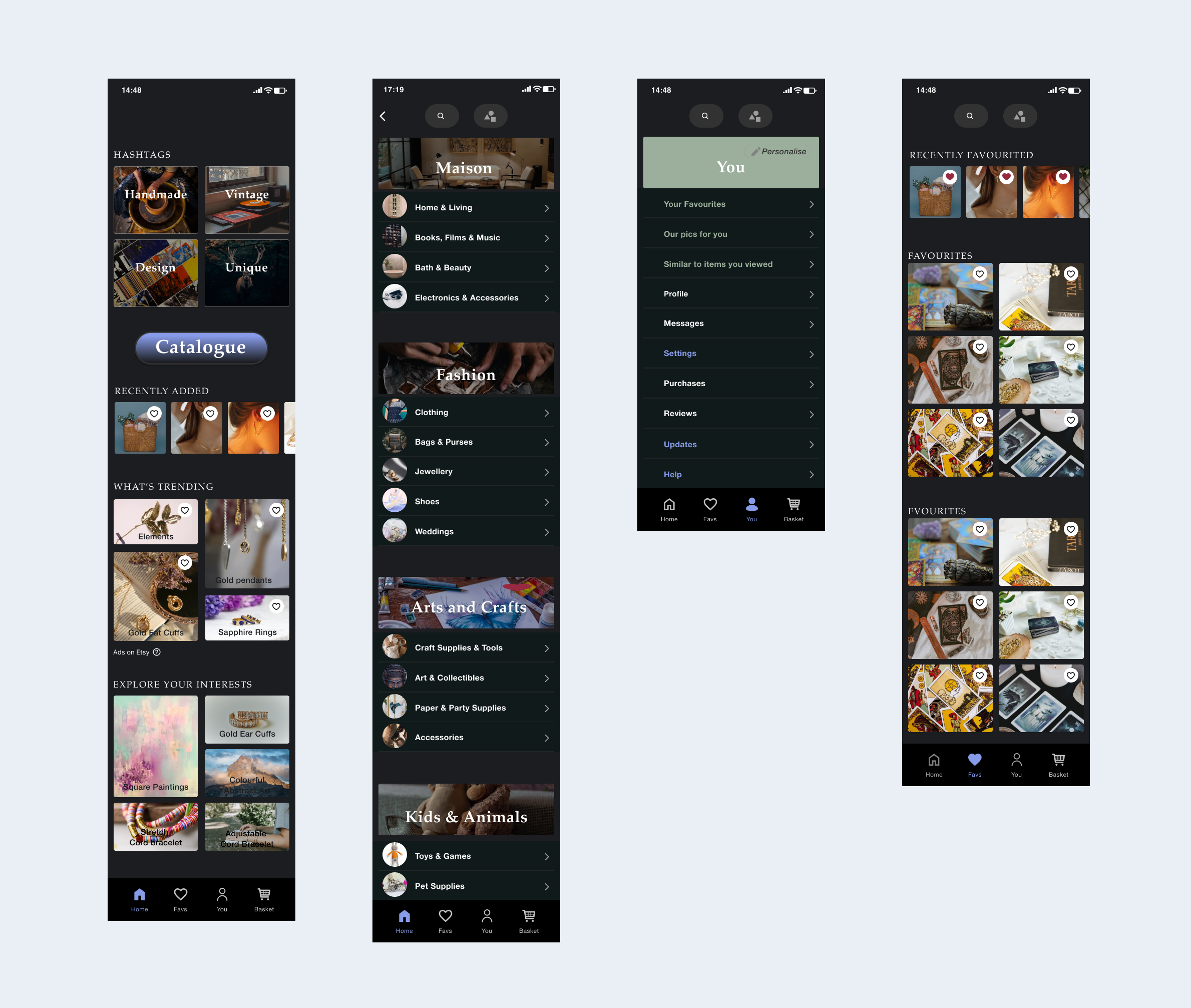
Homepage sections: The first sections Recently viewed and Our picks for you are placed on the home page, following by many similar sections, the page invites user for the endless scrolling.
Catalogue: user can access the catalogue via research bar. There are 15 categories proposed in Etsy’s roll-down catalogue.
Updates: this section is positioned directly on the menu bar, but what Updates really mean are the back to stock items and suggested shops for you. This section is positioned on the menu bar.
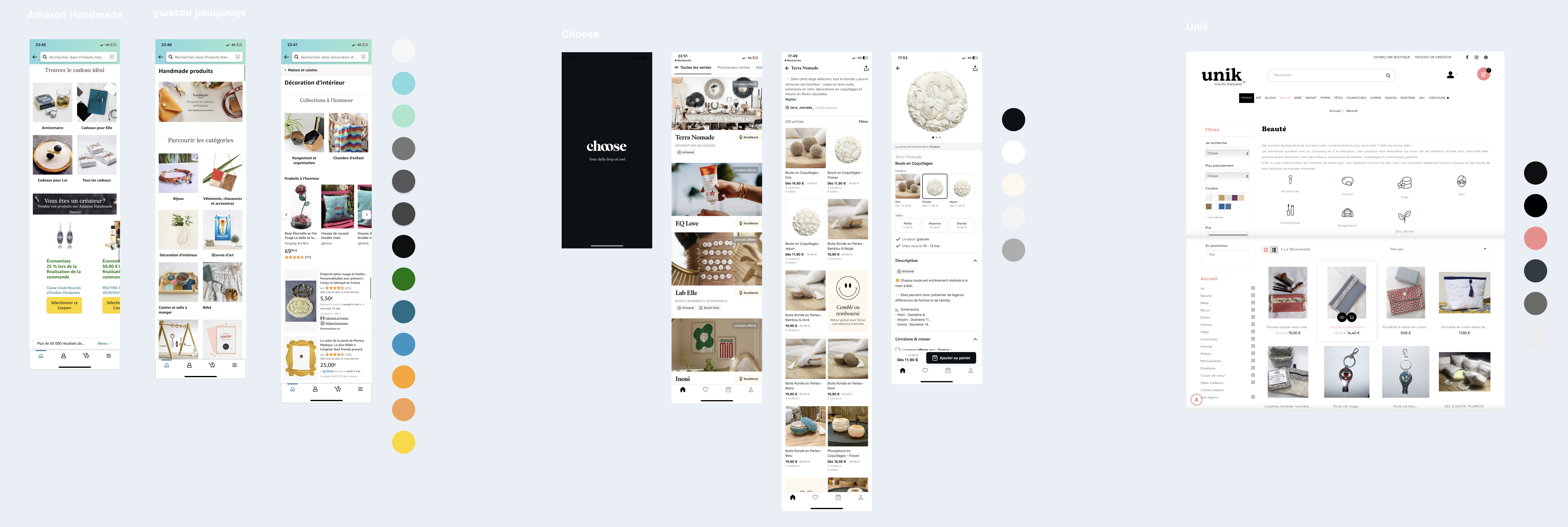
Nowadays Etsy takes a great part in this global market. The chosen competitors of Etsy in the Amazon handmade, Choose and Unik.
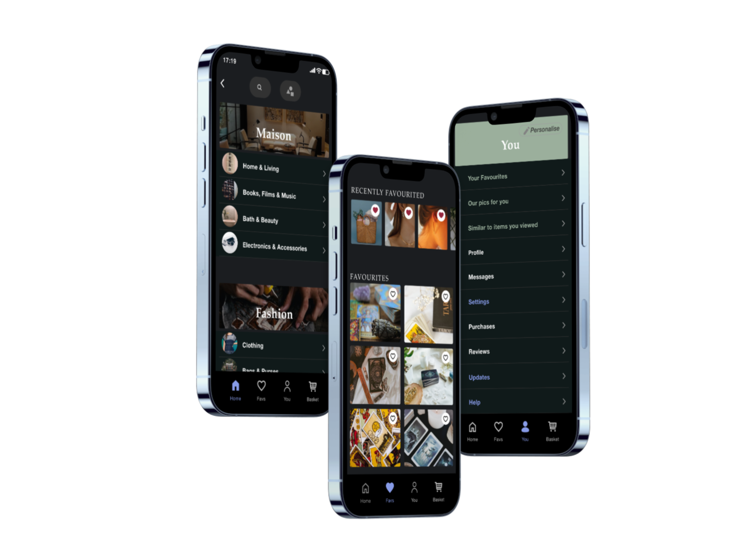
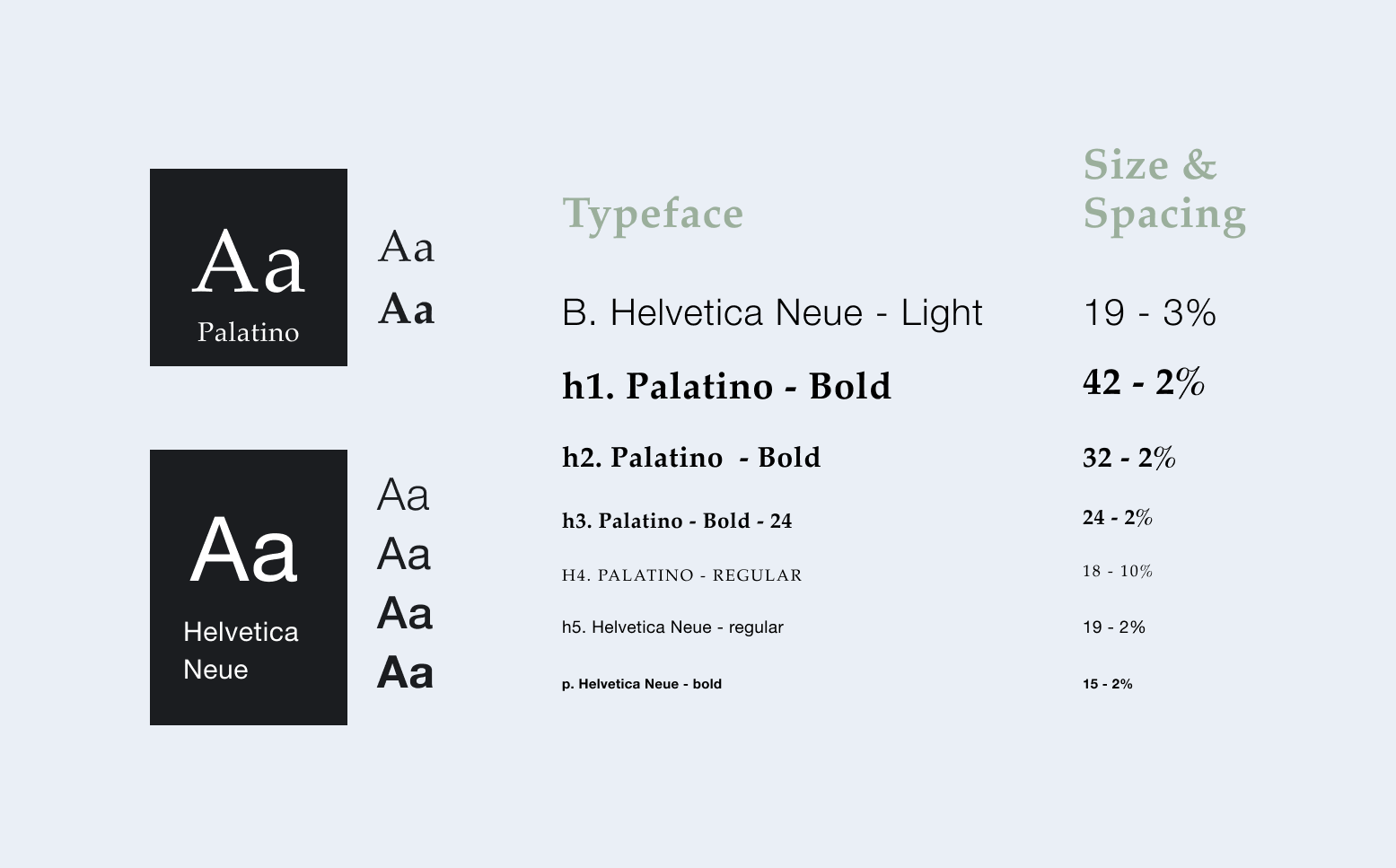
I wanted to find the right balance between clarity and consistency. Taking into account those principles and what I’ve learned about Etsy background and values, I would like to propose two aspects of Etsy application redesign, naw Typography and modifications in information architecture.
My goal is to make a proposition of typography that feels pleasant to eyes but is fully readable. New typography set: Palatino typeface variants for headings and Helvetica Neue for the subheadings and text. Palatino is old-style serif typeface considered humanistic, it is based on humanistic types of Italian renaissance. I thought its calligraphic style would express the human centred approach of Etsy. I paired Pallatino with Helvetica Neue, which is it’s complementary typeface.
The goal of information architecture is to be easy to comprehend and navigate. I moved the Updates section (which was placed on the manu bar) to the list on users You page. As well as sections Your favourites and Our pics for you from the homepage to the list on You page to gain simplicity and more coherence.
Given more time I would like to test the wireframe with more people, although I did share it on the design critic session and had many interesting comments, most of which I applied to my redesign.I noticed as a user that Etsy’s logo is not visible anywhere on the app, in the continuation of this project I would like to do the research and eventually propose different configurations of logo placement all around the app.
If you like what you see and want to work together, get in touch!
martyna_typology@outlook.com